顯示具有 [前端工程]網頁切版 標籤的文章。 顯示所有文章

2019年2月14日 星期四

【網頁切版】置中 transform: translate(-50%, -50%);


.gray{
  position: relative;
  border: 1px solid black;
  width: 400px;
  height: 200px;
  margin: 0 auto;
  background-color: rgb(247, 243, 243);
}

.red {
  position: absolute;
  width:100px;
  height: 100px;
  border: 1px solid red;
  top:50%;
  left: 50%;
  transform: translate(-50%,-50%);
}

.blue {
  position: absolute;
  width:100px;
  height: 100px;
  border: 1px solid blue;
  top:50%;
  left: 50%;
}
  • 會以左上角那點為50%的定位點,因此用 transform: translate(-50%, -50%) 是為了讓div往左、上偏移50%。
  • position: absolute 會去抓外層的relative父元素做定位
​

2018年7月9日 星期一

2018年7月2日 星期一

【RWD】議題(2):表格太長怎麼辦


方法1:把不重要的資訊弄掉

<tr>
                <td  class="m-none">2000001</td>
                <td>2018/02/05</td>
                <td>王小名</td>
                <td>冰箱</td>
                <td>20000</td>
                <td  class="m-none">  //增加class
                    <input type="button" value="修改">  
                    <input type="button" value="刪除">
                </td>
 </tr>
@media(max-width: 560px){
    .m-none{
        display: none
    }
}
//讓他在特定的大小以下,就消失

方法2:使用overflow-x:auto

*用一個div.container把table包起來,然後設定overflow-x:auto
  • table本身設定一個不錯的寬度
<div class="container">
        <table class="order">
           //省略
        </table>
 </div>
@media(max-width: 560px) {
    .container {
        overflow-x: auto;
    }
    .order {
        width: 1000px;
    }
}
​

【RWD】起手式:斷點、container、Viewport、max-width、%數


標準原則

  • 不可以出現X軸
  • 觸控高度一定要44px
  • 不要太寬,不要太擠

熱門斷點

  • PC:1280px / 960px
  • ipad:768px
  • iphone:375px

重點

外圍:width 100%
中間:container固定為max-wisth: 960px or 1280px(然後margin auto)

高度問題

區塊高度不ㄧ樣
解法:height寫死,然後等到變成單欄在height:auto
PC版header的高度height可以寫死
(header本來就不會莫名其妙多出內容)
但等到mobile變成單欄要改成height:auto

Viewport

強制讓螢幕解析度等於載具寬度
<meta name="viewport" content="width=device-width, initial-scale=1.0">

media

@media (max-width:375px) {
    #title {
        color: black;
    }
}

width→max-width(超好用)

.wrap {
    max-width: 900px;
    margin: 0 auto;
}

%數(會根據父元素計算)

三欄式寫法
.news li {
    width: 31.3333%;
    margin-left: 1%;
    margin-right: 1%;
    margin-bottom: 1em;
    float: left;
}

@media(max-width:780px) {
    .news li {
        width: 48%;
    }
}

@media(max-width:375px) {
    .news li {
        width: 99%;
    }
}
​

2018年6月21日 星期四

【網頁切版】flex(float併排、absolute相疊、flex外掛)


flexbox

  • 最重要的數值放在「外層容器」(float設在元素上)
  • 先設定主軸、附軸,然後再決定如何對齊
  • display:flex 設定flex排版
  • flex-direction:row/column 設定主軸附軸 (如果是row主軸在x軸上,如果是column主軸在y軸上)
  • justify-content: flex-start / center / flex-end/space-around/space-between 主軸的對其
  • align-items:flex-start / center / flex-end /space-around/space-between附軸的對齊
  • 缺點是支援比較低,要不要用flex完全是看用戶數,如果消費者主要都是用IE的老人,就不適合用flex排版。
}
 <div class="out">
    <div class="box">1</div>
    <div class="box">2</div>
    <div class="box">3</div>
  </div>
.out {
 background-color:blue;
 height:1000px;
 display:flex;
 flex-direction:row;  //設定主軸在X上,並且是左到右
 justify-content: flex-end; //設定對齊主軸的尾端
 align-items:flex-end;  //設定對齊附軸的尾端
 }
​


flex的navbar排版

<div class="outer">
  <div class="inner" style="margin-right:auto"></div> //可以隔開與他者的距離
  <div class="inner"></div>
  <div class="inner"></div>
</div>
.outer{
 //略
  display:flex;
  flex-direction:row;
  justify-content:flex-start;
  align-items:flex-start;

}

align-self

  • 可以單獨改變一塊的排版
  • 寫在inner當中
  • align-self:flex-start / center / flex-end/space-around/space-between
.inner{
  height:200px;
  width:30%;
  border:1px solid black;
  background-color:yellow;
}

.box1{ //寫在想要的區塊裡面
  align-self:flex-end;
}
​


2018年6月14日 星期四

【網頁切版】我不是很會用的表格table


  • table>tr(感覺沒啥用的標籤)>th(標題) or td(內容)
  • 一定要先table css 給 reset
table {
    border-collapse: collapse; //border崩解
    border-spacing: 0;   //
}
  <table>
            <tr>
                <th>1</th>
                <th>2</th>
                <th>3</th>
                <th>4</th>
            </tr>
            <tr>
                <td>main</td>
                <td>main</td>
                <td>main</td>
                <td>main</td>
            </tr>
            <tr>
                <td>main</td>
                <td>main</td>
                <td>main</td>
                <td>main</td>
            </tr>
            <tr>
                <td>main</td>
                <td>main</td>
                <td>main</td>
                <td>main</td>
            </tr>
        </table>
table {
    border-collapse: collapse;
    border-spacing: 0;
}

th {
    padding: 10px 30px;
    background: rgba(124, 124, 124, 0.4);
}

td {
    border-top: 1px solid black;
    border-bottom: 1px solid black;
    padding: 30px 30px;
}
​

2018年6月12日 星期二

【網頁切版】一些常常忘記的CSS屬性


一些常常忘記的CSS屬性

  • a標籤噁心的底線
text-decoration: none;
  • 常常拼錯的盒子
 box-sizing: border-box;
  • 常常忘記的背景設定
background-repeat:none (預設是repeat-x / repeat-y)
​

【網頁切版】把文字替換成圖片


在網站的上面很常會放logo連結,但是....如果只放圖片google就會爬不到字了耶

因此就出現了把文字替換成圖片技巧了,簡單來說就是三行
其他注意事項

  • logo文字要放在h1中,google才會覺得他重要去爬他
  • 表頭按鈕最好要用ul>li寫,這樣比較好閱讀
text-indent: 101%;  //把第一行縮排
overflow: hidden;  //把多出去的隱藏
white-space: nowrap;  //不換行
 <div class="header">
        <h1>
            <a href="">六角學院</a>  //把東西放在h1中,google才會覺得他重要!
        </h1>
        <div class="menu">
            <ul>
                <li>
                    <a href="#">聯絡我們</a>
                </li>
                <li>
                    <a href="#">產品介紹</a>
                </li>
                <li>
                    <a href="#">首頁</a>
                </li>
            </ul>
        </div>
    </div>
.header h1 a {
//長寬省略
display: block 
background-image: url("圖片連結");
text-indent: 101%;  //把第一行縮排
overflow: hidden;  //把多出去的隱藏
white-space: nowrap;  //不換行
}
​

【網頁切版】總結的重要原則還有壞習慣


  • 要區分主板(width:980px)跟container
  • 要先排框架,再加內容,不要一開始就急著把內容填進去。然後絕對不要相信自己的肉眼,要先用border看一下padding、margin的狀況
  • 命名很重要!
  • 把navbar寫成width:100%(壞習慣)
這樣子如果螢幕太大會長得很怪,因此好的做法是navbar寬固定,外面再包一層100%把它包起來(注意大寬度的時候,讓他能夠置中)
  • 同類型的東西用ul>li 寫比較好(比如說表頭按鈕、許多商品),而不要用div寫,因為用ul>li的結構比較容易看得出來是同類型的東西【基於閱讀上的便利性】
 <ul>
            <li>咖啡</li>
            <li>電燈</li>
            <li>西瓜</li>
            <li>紅豆</li>
 </ul>
  • 重複寫class,導致後面很難維護。可以改用#outer li 【基於維護/閱讀上的理由】
 <div id="outer">
        <ul>
            <li class="box">咖啡</li>
            <li class="box">電燈</li>
            <li class="box">西瓜</li>
            <li class="box">紅豆</li>
        </ul>
    </div>
​


【網頁切版】想併排用float,想重疊用absolute


float語法

  • 使用時機:想要讓元素進行左右併排
  • float:left / right
<div id="outer">
        <div class="box"></div>
        <div class="box2"></div>
        <div class="box"></div>
    </div>
#outer {  
    width: 900px;
    margin: 0 auto;   //外層置中
}

.box {
    float: left;   //靠左
    border: 1px solid black;
    width: 200px;      
    height: 600px;
}

.box2 {
    float: left;    //靠左
    border: 1px solid black;
    width: 500px;
    height: 600px;
}

float去除浮動clear:both


  • float的缺點就是它不會撐開外部容器,所以需要加上clear讓外部容器正常撐開
  • 如果A元素開始不打算加入併排,就要在A元素的CSS加上clear:both
  • 建議把clear:both單獨寫在class=clearfix的div上,因為假設有n個需要clear,這樣就要必須改n個CSS(超級很麻煩),所以不如直接用div加在HTML上
<body>
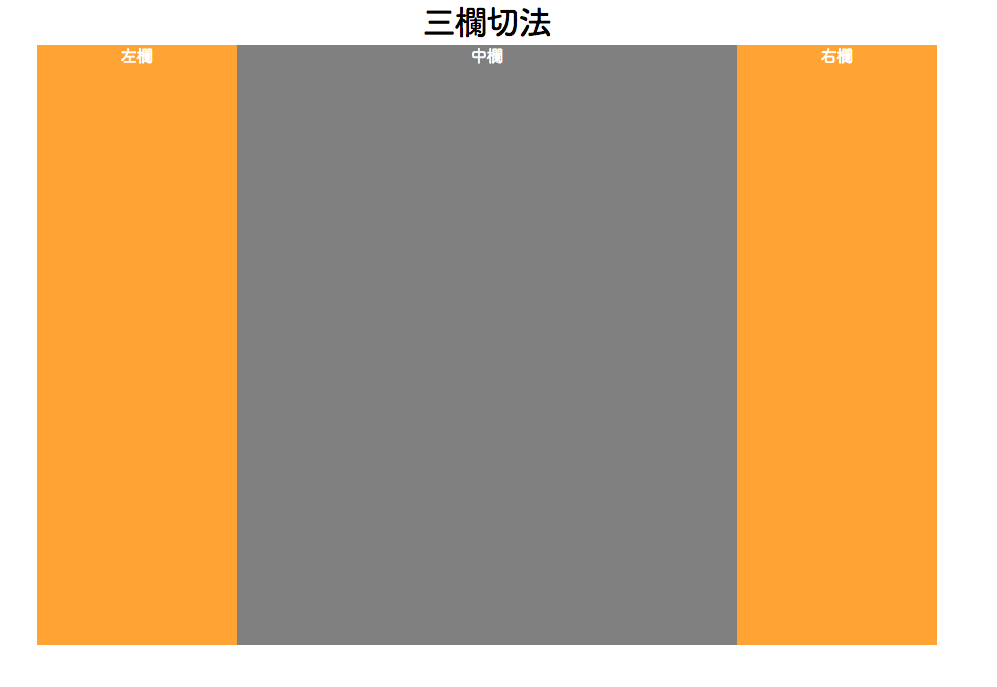
    <h1 style="text-align:center">三欄切法</h1>
    <div id="outer">
        <div class="header">表頭</div>
        <div class="left">左left</div>    // 開始併排float: left
        <div class="right">右left</div>  // 開始併排float: right;
        <div class="clearfix"></div>  // 結束併排clear: both;
        <div class="footer">不打算參與併排時,前面或自己要加clear</div>
        <div class="alone-left">左left</div>   
        <div class="small-left">左left</div>    // 開始併排float: left
        <div class="small-left">左left</div>    // 開始併排 float: left
        <div class="clearfix"></div>  // 結束併排clear: both;
        <div class="alone-left">不打算參與併排,前面或自己要加clear</div> 
        <div class="footer">表尾</div>
    </div>
</body>
​


absolute/ relative定位

​


  • 使用時機:想要讓元素進行重疊
  • 圖層關係:CSS與下面圖層愈上面,z-index愈大愈上面
  • Absolute定位:當下absolute時,元素會去找有設定relative的父元素為座標系定位,而如果都沒有就是以body為定位
  • 缺點:absolute不會撐開父元素,因此如果元素本身太寬,會超出去。
​


【JavaScript】用物件Mapping的方法

If的寫法 我們希望當變數是a時就回傳1,變數是b就回傳2,變數是c就會回傳3,一般寫法就是用if,但是這樣會很冗 ​ // IF style var word if(word == 'a'){ word = 1 } else if...